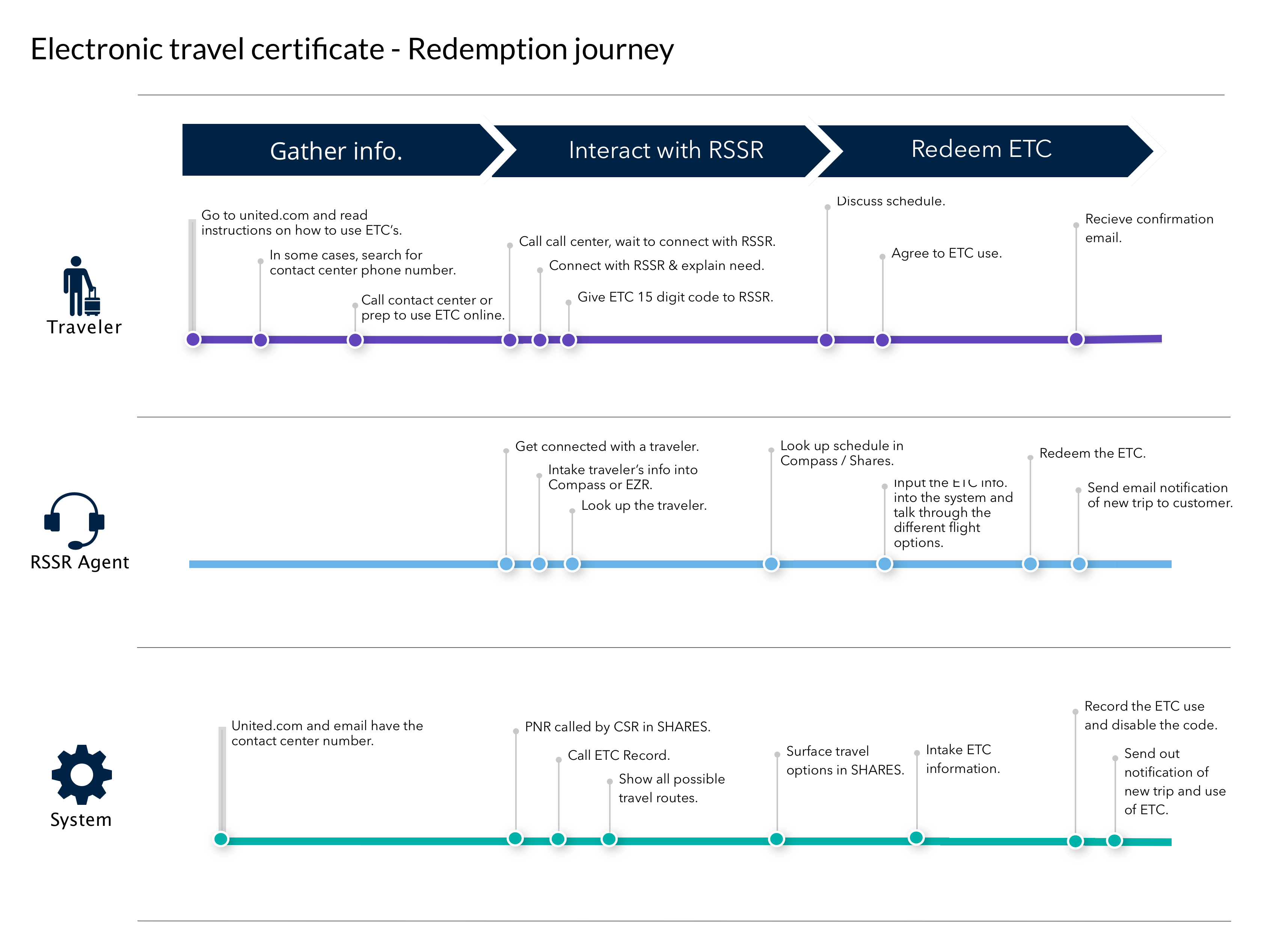
Digitizing self-service for travel certificates

Role: UX research, interaction + visual design

Stakeholder: Customer Solutions and Recovery at United Airlines

Deliverables: Site flows, interactive prototypes, accessibility guidelines, UI/visual design, pattern library components for design system, digital experience for responsive website and native iOS + Android app

Overview

United Airlines issues Electronic travel certificates (ETCs) to customers as a form of compensation that is redeemable for future travel purchases with the airline. As certificates are only issued via print or email with limited and difficult to find information on how to use them, customers are often driven to call the contact center for help. I was tasked with making it easier for airline members to keep track of and use their travel certificates.

Discovery

Map current flow

Using an existing journey map, I audited the current flow from when a certificate is issued to when it is redeemed, gathering background on what is surfaced to a customer and when, to help me prioritize what to include in my designs.

Gather customer feedback

For a better understanding of the problem to solve, I looked to the contact center for any customer feedback to share, as well as noticeable themes from certificate-related calls, as agents were the main touch point fielding questions. To get a sense of user expectations, I was able to leverage qualitative feedback from related a user testing baseline that I had recently conducted for a similar topic.

Key insights:

  • United is issuing 44% more travel certificates and call volumes continue to rise
  • Customers have a strong association between miles and certificates, both are seen as a form of "United or loyalty currency” that does not belong to the individual
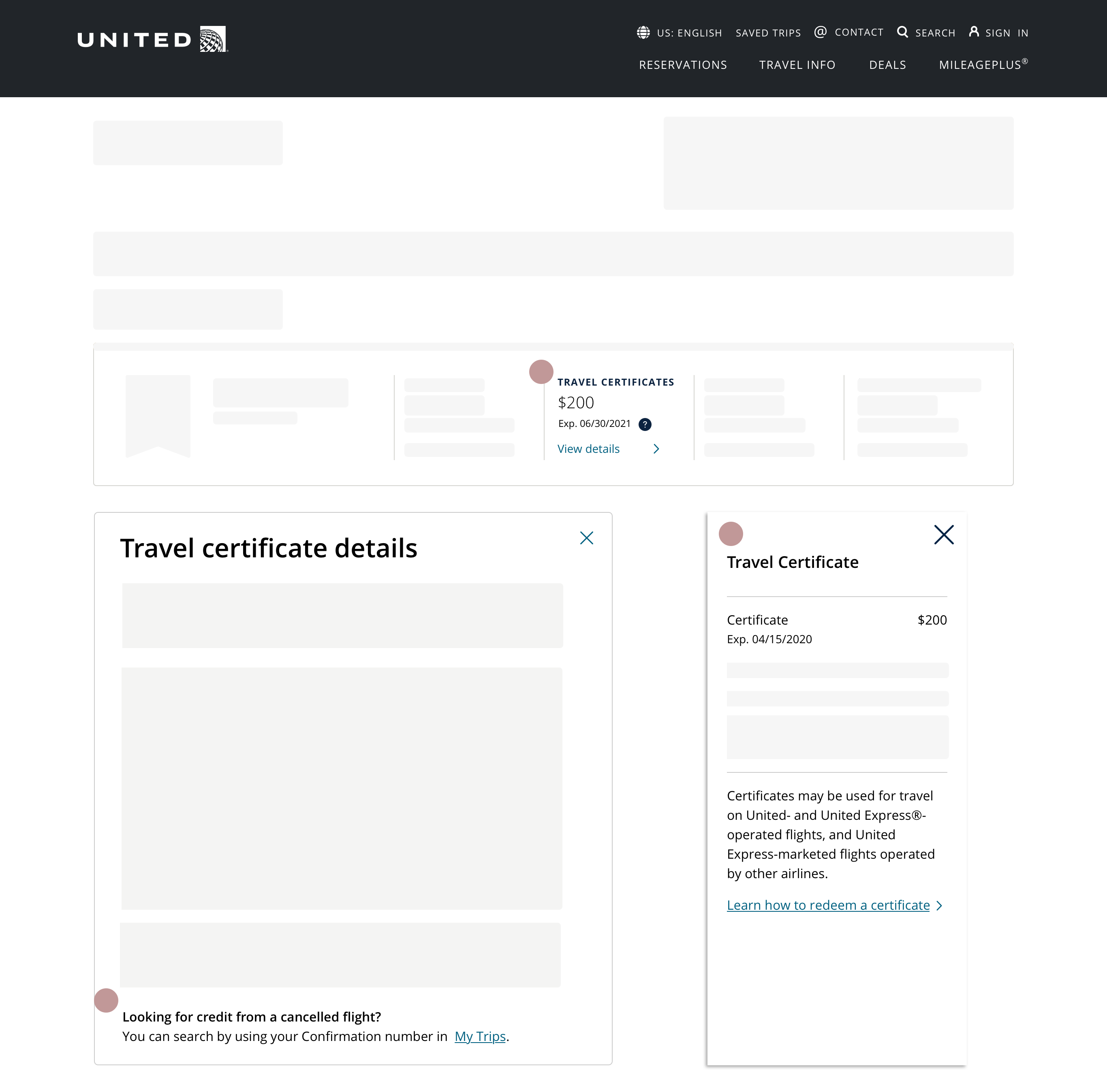
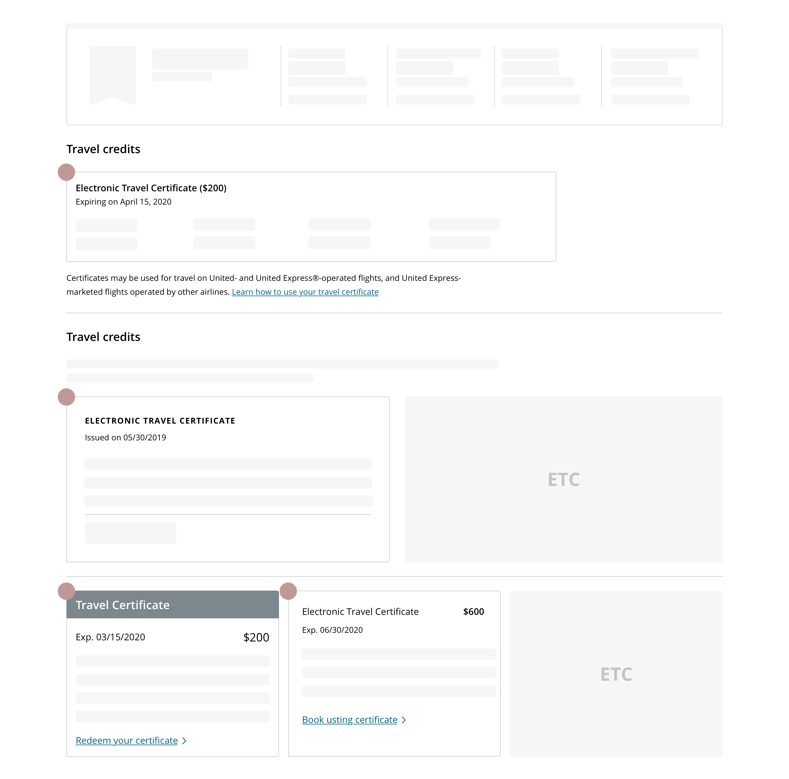
  • Customers have a general suspicion of airline credits as the way that they’re issued can be easily lost (via email) and the way they can be used is difficult (due to restrictions)
  • Overall, the lack of online visibility contributes to the main customer pain points being:
    • How to use an ETC - Customers are confused when trying to redeem their ETCs, and do not know when or where they can apply their ETC
    • How to retrieve ETC - Customers often never receive the email with their ETC

Design

Refine product requirements

With a better sense of how to drive value in improving the ETC experience for customers, I navigated through a series of conversations with leadership, product, and technology teams to refine requirements for the digital experience in order to align delivery expectations.

Define design scope

While the eventual goal would be to display multiple forms of travel credit to a user, given that flight credit from a changed/cancelled flight reservation had complex fare rules and technical services limitations, the initial design was to focus solely on electronic travel certificates, with an ability to scale for other forms of compensation in the future. Additionally, as half of the certificates issued were to a MileagePlus member, the initial design scope focused on integrating ETCs into United accounts first.


With a defined scope and research insights, I focused my ideation on these design principles:

  • Findability of information - displaying the travel certificate in an intuitive location to allow users to find what they’re looking for quickly
  • Contextual content - presenting the right amount and level of detail at the most contextual location to help users understand their options and take next steps

I began with sketching ideas for the page layout and certificate details, leveraging existing information architecture and hierarchy.

My ideation evolved into the digital space using wireframes with a more detailed visualization of how content would be organized and scale for different use cases, modifying existing design patterns as needed.

Validation

Despite working within a tight timeline to deliver (literally - updates were shared on a daily basis), I partnered with a UX researcher to plan, conduct, and synthesize a quick round of concept validation testing within two days (a personal record!).

User research goal + methodology

I opted for usability testing in order to determine which, if either, design concept met user needs. Within a day, I built two click-through InVision prototypes that were launched online for remote, unmoderated testing that same evening. By the next morning, we had feedback videos from 14 participants - mainly travelers who had recently received airline credit within the past 6 months.

Prototype I - Travel credits summarized at top next to loyalty balances

Reference: Prototype I

  • Applying research insight on how users associated travel certificates with loyalty currency, I added travel certificates as a column to the existing summary bar to maintain the same hierarchy as other loyalty balances.

Prototype II - Travel credits appear in a dedicated section below summary of loyalty balances

Reference: Prototype II

  • Considering an environment where there are more flight cancellations than bookings, I created a dedicated section to surface existing credit and provide actionable next steps

Key findings

Overwhelmingly, participants preferred Prototype II for its dedicated section because they could see all of their credits exposed, the different amounts and expirations dates, as well as have the ability to expand for more details.

“I liked seeing it all out there right away. It was super clear what credits I had” - Research participant

  • Users also really liked having the “book with certificate” call-to-action option as a visible and quick next step when they are ready to book
  • Several mentioned wanting more information in the details section in general, including information about usage and restrictions

Refinement

Testing feedback helped to validate design decisions I originally made such as surfacing the credits vs. just summarizing them, organizing the layout by expiration date, and including call-to-action links for next steps. It also helped me identify that having more detailed information was an area of improvement in my design iteration. Having this qualitative feedback also enabled the product team to accelerate decision-making and gain approvals from leadership and project stakeholders.

Outcome

The dedicated travel credit section appears in a United account for members who have a valid Electronic travel certificate. This direction allows roofer improvement as traveler needs change and has the potential to expand and include other forms of payment and compensation, if needed. The ability to view and use an ETC from a member account on United’s digital channels launched in May 2020- helping over 5K members access their certificates within the first day.

Next steps

As the ability to access and use certificates evolve on United’s digital channels, I continue to push for ways to generate qualitative feedback loops that are used to prioritize future enhancements that can map toward a more holistic compensation strategy for the airline’s customers.